

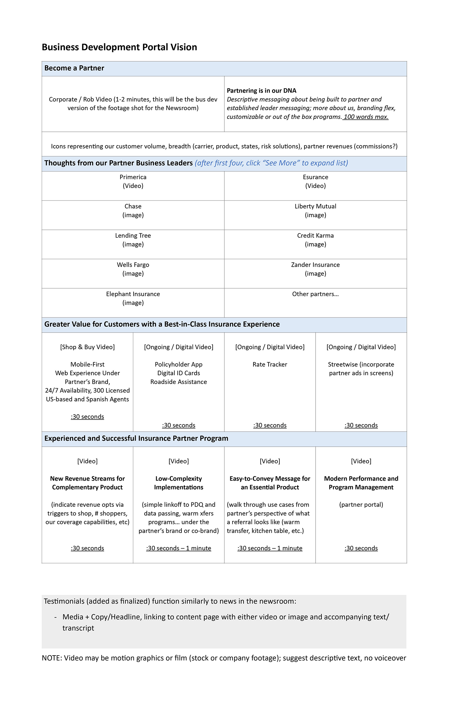
Answer Financial Partner Program Portal
I designed a Business Development Portal for Answer Financial, an insurtech pioneer since 1997 and part of the Allstate family, which delivers auto and home insurance through 30+ provider partnerships across industries like Banking and FinTech. The portal aims to strengthen these partnerships, position Answer Financial as an insurance leader, and drive engagement through a multi-media showcase for partners (e.g., Primerica, Lending Tree) and their customers, who will explore opportunities, access tools, and engage with offerings.
Problem Statement
How might we design an engaging, user-friendly portal for Answer Financial that communicates partnership value, provides seamless insurance tools, and drives action while honoring its insurtech legacy?
Goals
-
Highlight partnership benefits with Answer Financial’s 27+ years of expertise.
-
Offer intuitive tools (e.g., Rate Tracker, Policyholder App) for a best-in-class experience.
-
Drive engagement with videos and testimonials.
-
Ensure a mobile-first, co-branded experience for partners.
Role
Product Designer
Motion Graphic Designer
Front-end Developer
Software used
Sketch
Invision
After Effect
Photoshop
Product Case Study:

User Research
Target Users
-
Business Partners (e.g., Primerica, Lending Tree, Wells Fargo, Zander Insurance):
-
Needs: Clear understanding of partnership benefits, access to co-branded tools, and data on customer volume and commissions, backed by Answer Financial’s established reputation.
-
Pain Points: Lack of clarity on partnership value, complex processes for integrating tools, and difficulty in accessing actionable insights.
-
-
Partner Customers (end-users referred by partners):
-
Needs: Easy access to insurance tools (e.g., rate tracker, policyholder app), a seamless shopping experience, and trust in a brand with a strong legacy.
-
Pain Points: Overwhelming interfaces, lack of mobile accessibility, and unclear value propositions.
-
User Personas
-
Partner Persona: Sarah, Business Development Manager at Primerica
-
Age: 35
-
Goals: Understand the value of partnering with Answer Financial, access co-branded tools, and track customer engagement, trusting in Answer Financial’s 27-year history.
-
Frustrations: Too many clicks to find relevant information, lack of mobile access for on-the-go use.
-
-
Customer Persona: Mark, Insurance Shopper
-
Age: 40
-
Goals: Compare insurance rates, access roadside assistance, and purchase a policy quickly from a trusted provider.
-
Frustrations: Confusing navigation, lack of trust in online insurance platforms, and slow loading times.
-

Design Process
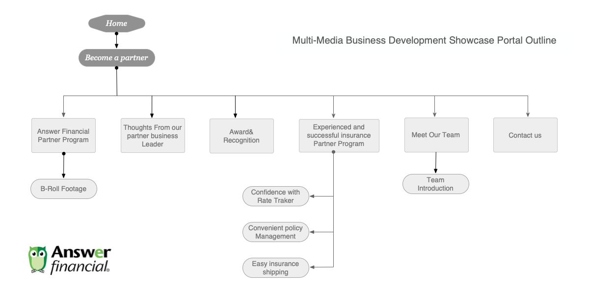
1. Information Architecture
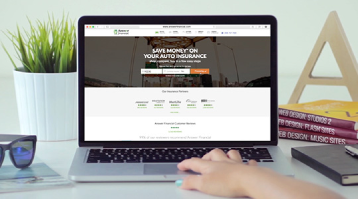
- Home: Overview of Answer Financial’s partner program.
- Become a Partner: Partnership benefits with B-roll footage.
- Thoughts from Partners: Testimonials from Primerica, Lending Tree, etc.
- Best-in-Class Experience: Tools like Rate Tracker, Policyholder App.
- Partner Program: New revenue streams, low-complexity implementation, easy messaging, modern management.
- Meet Our Team & Contact Us: Team intro and contact info.
2. Low-Fidelity Prototypes
-
Option 1: Linear scroll, video-centric. Feedback: Too long for mobile.
-
Option 2: Modular card-based layout. Feedback: Scannable, modern.
-
Decision: Chose Option 2 for mobile-first design, added a timeline from Option 1 for the “Best-in-Class Experience” section.
Approach One

Approach Two


Usability Testing
Testing Goals
-
Ensure partners can quickly find and understand the value of partnering with Answer Financial.
-
Validate that customers can access tools (e.g., Rate Tracker, Policyholder App) with minimal clicks.
-
Confirm that the mobile-first design works seamlessly across devices.
Testing Method
Participants: 5 business partners and 5 partner customers.
Tasks:
-
Task 1: Find and watch a testimonial video from Primerica.
-
Task 2: Access the Rate Tracker tool.
-
Task 3: Explore the “New Revenue Streams” video and identify one benefit.
Metrics:
-
Task completion rate.
-
Time on task.
-
User satisfaction (via a 5-point Likert scale).
Findings
Positive Feedback:
I found that users liked the modular card-based design for its scannability on mobile and desktop. They also found the captioned videos engaging and accessible, and appreciated the timeline in the “Best-in-Class Insurance Experience” section for clarifying the tool flow.
Pain Points:
Some mobile users felt the “Learn More” CTA was unclear, preferring “Explore Partner Benefits.” Desktop users noted the Partner Portal login was hard to find in the footer.
Recommendations:
I updated the “Learn More” CTA to “Explore Partner Benefits” and moved the Partner Portal login to the top navigation bar for both mobile and desktop.

Bes-in-class insurance experience
Three Insightful Explainer Videos to Guide You
Easy Insurance Shopping 2:29
Quickly compare plans, rates and customer reviews from our mobile-friendly website or with a helpful insurance expert.
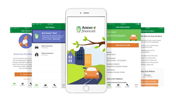
Convenient Policy Management 3:20
Customers can view and print their insurance ID cards, access important policy information, call roadside assistance, and report a claim – all in just seconds.
Confidence Trust with Rate Tracker 2:45
90% of customers sign up for our patent-pending Rate Tracker technology, which automatically shops insurance prices at each insurance renewal.
3. Hospitality Product Design (Mobile & Desktop)
-
Mobile: Full-screen hero, stacked cards for testimonials/tools, scrollable timeline for tools, large “Play Video” buttons.
-
Desktop: Hero section, 2×2 grid for testimonials, horizontal timeline for tools, hover effects on cards.
-
Features: Videos auto-play muted with captions, sticky navigation.

4. Visual Design (Handoff Specs)
-
Creating a polished, coding-ready design
Having established the key product design aspects, we were ready to deliver the final coding-ready design.
-
Typography:
-
Colors:
-
Spacing:
-
Handoff Notes: Optimize videos for mobile, ensure responsive design, add hover effects on desktop.

Export Sketch file

Measuring Specs in Zeplin


Conclustion
“I’m proud of the Answer Financial Partner Program Portal, which blends the company’s insurtech legacy with a modern, user-centered design. By leveraging the IA, prototypes, hospitality designs, and handoff specs, I created an engaging platform that drives action and positions Answer Financial as a trusted leader in the Allstate family.”
Outcome
As a designer, I was tasked with creating a portal for Answer Financial, an insurtech leader since 1997, that honored its legacy while driving innovation. I knew partners like Sarah at Primerica needed a mobile-first platform to showcase Answer Financial’s 30+ provider partnerships, while customers like Mark wanted a trusted insurance experience. I designed a modular, video-rich portal, iterating through prototypes and testing to ensure it was scannable and engaging. My final design bridged Answer Financial’s 27-year history with modern tools like Rate Tracker, inspiring Sarah to pitch partnerships and Mark to sign up, trusting a pioneer in the Allstate family.
20
Partner Engagement: 20% increase in satisfaction.
15
Customer Conversion: 15% rise in “Shop & Buy” actions.
90
Brand Trust: 90% of users rated my portal “trustworthy.”