

Product design of Poshly’s proprietary
data and analytics platform for
beauty brands that increased
conversions by 35% and
reduced costs by 2x
Key Contributions
User Research
Information Architecture
Interaction Design
Pixel Perfect Design
Style Guide
Branding
Team
Leadership
Engineer
Front-end Dev
Marketing
Myself
Timeline
5 Months
Tools
Adobe Suite
OmniGraffle
Whiteboard
INTRO
Providing beauty brands access to hyper-personal consumer data on beauty habits and tastes
Poshly offers consumers the chance to win various beauty-related freebies in exchange for filling out questionnaires and providing detailed personal beauty-related information. The collected information is analyzed and made available to beauty brands who want more in-depth information about their consumers.
Awards & Mentions
-
Top 10 World’s Most Innovative
-
CEO Nominated Forbes 30 Under 30
-
Best of the Web
GOAL
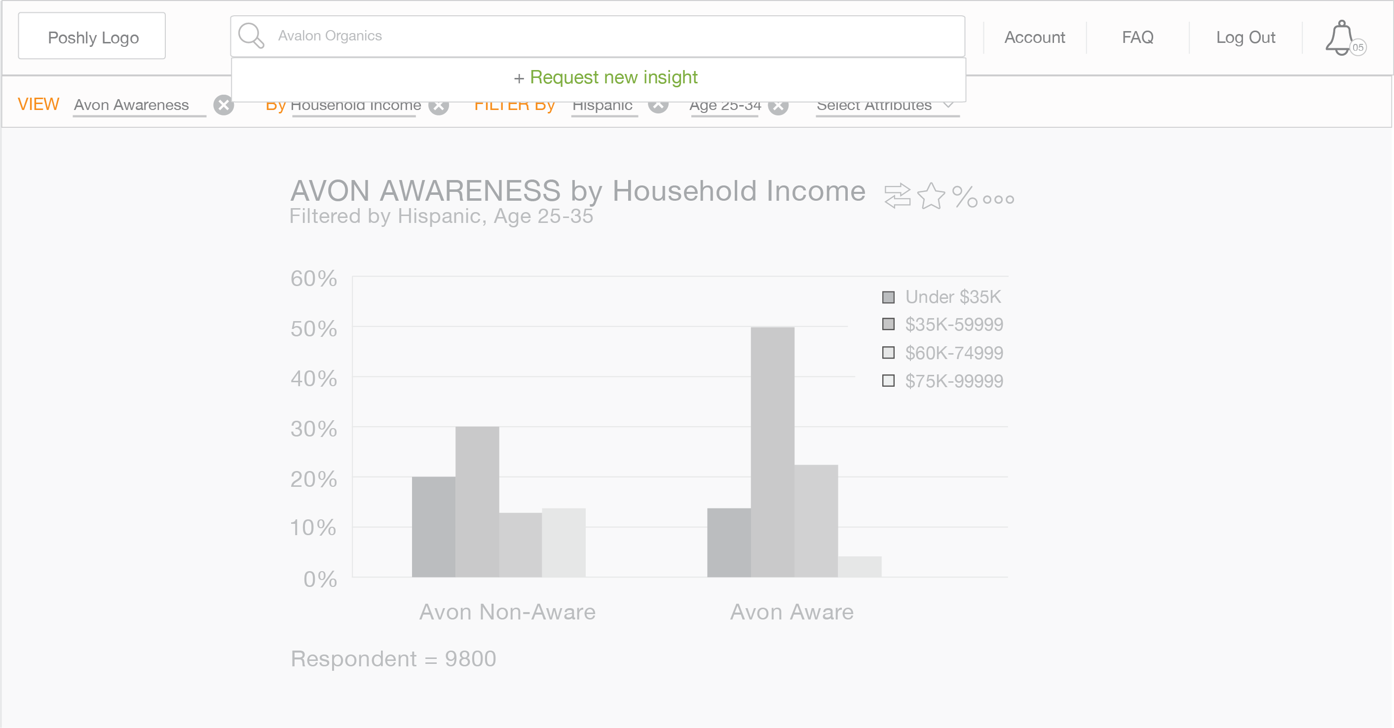
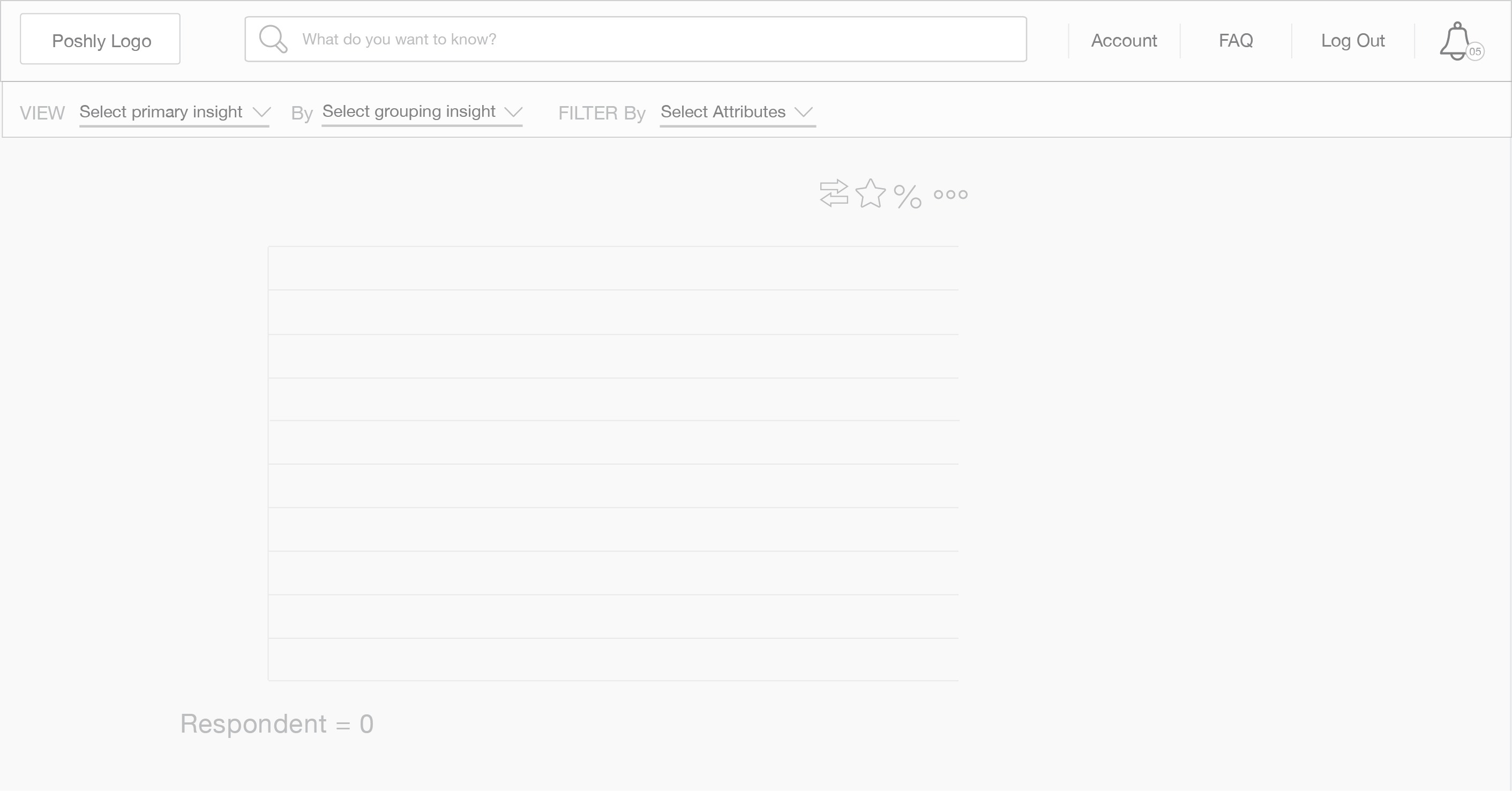
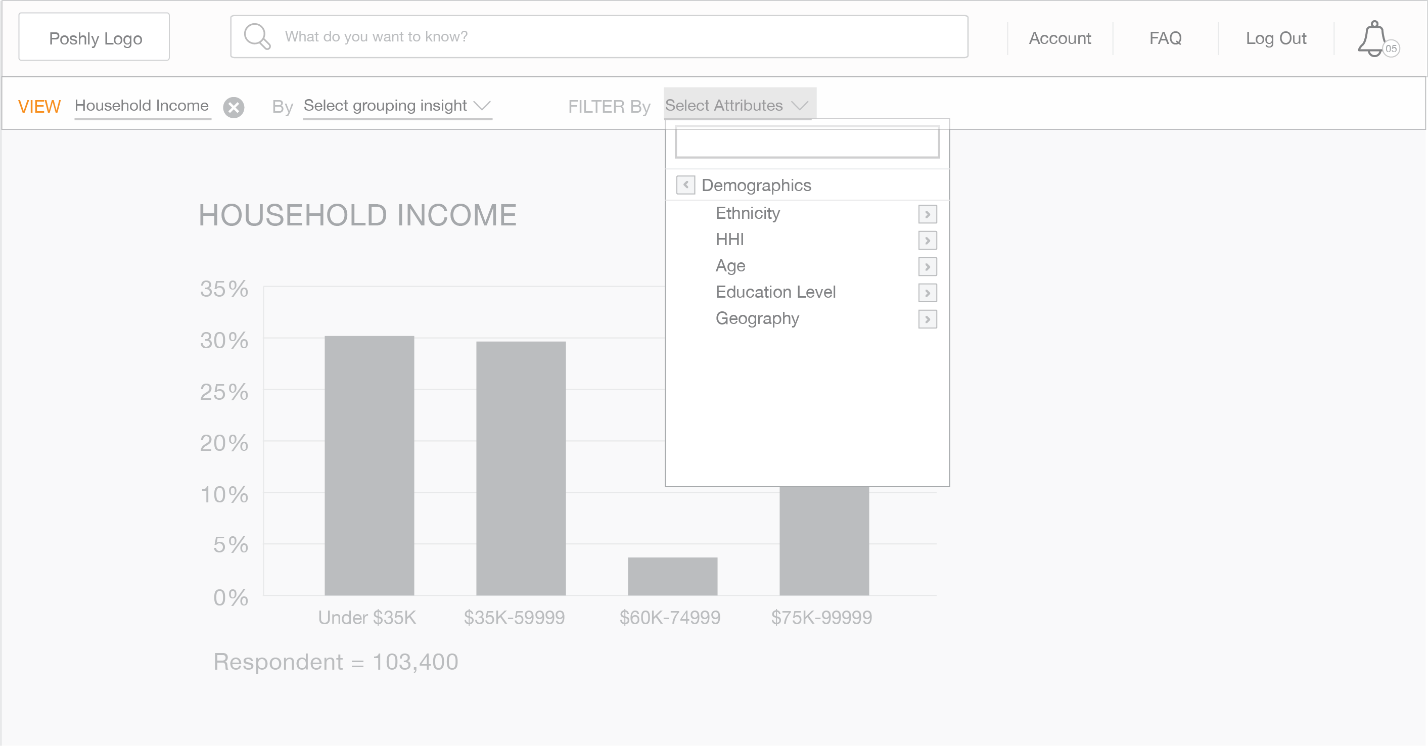
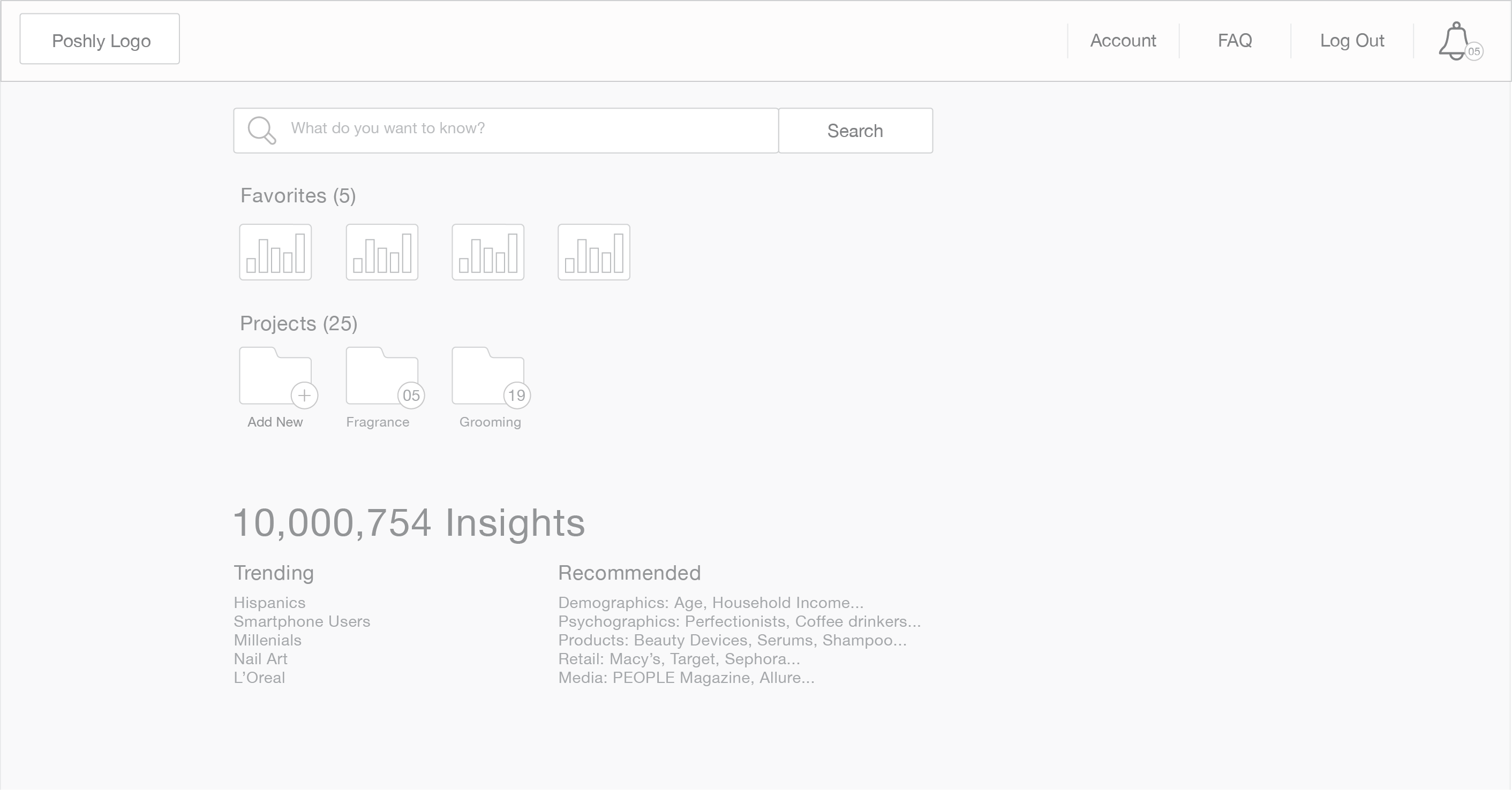
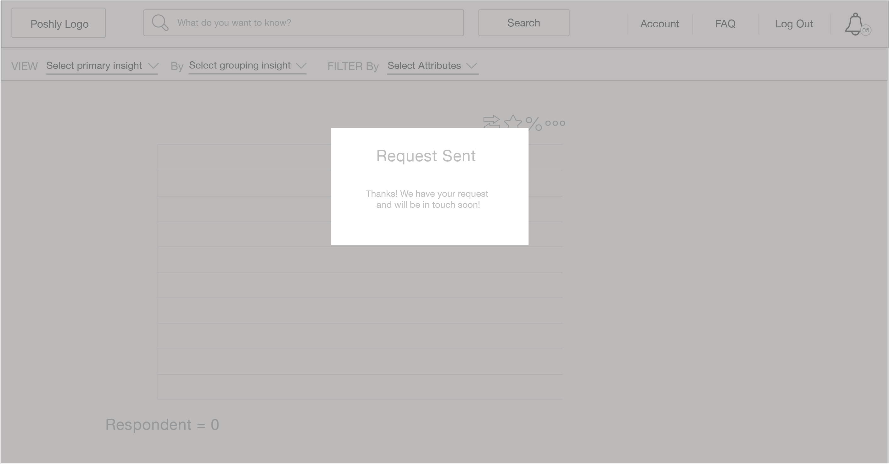
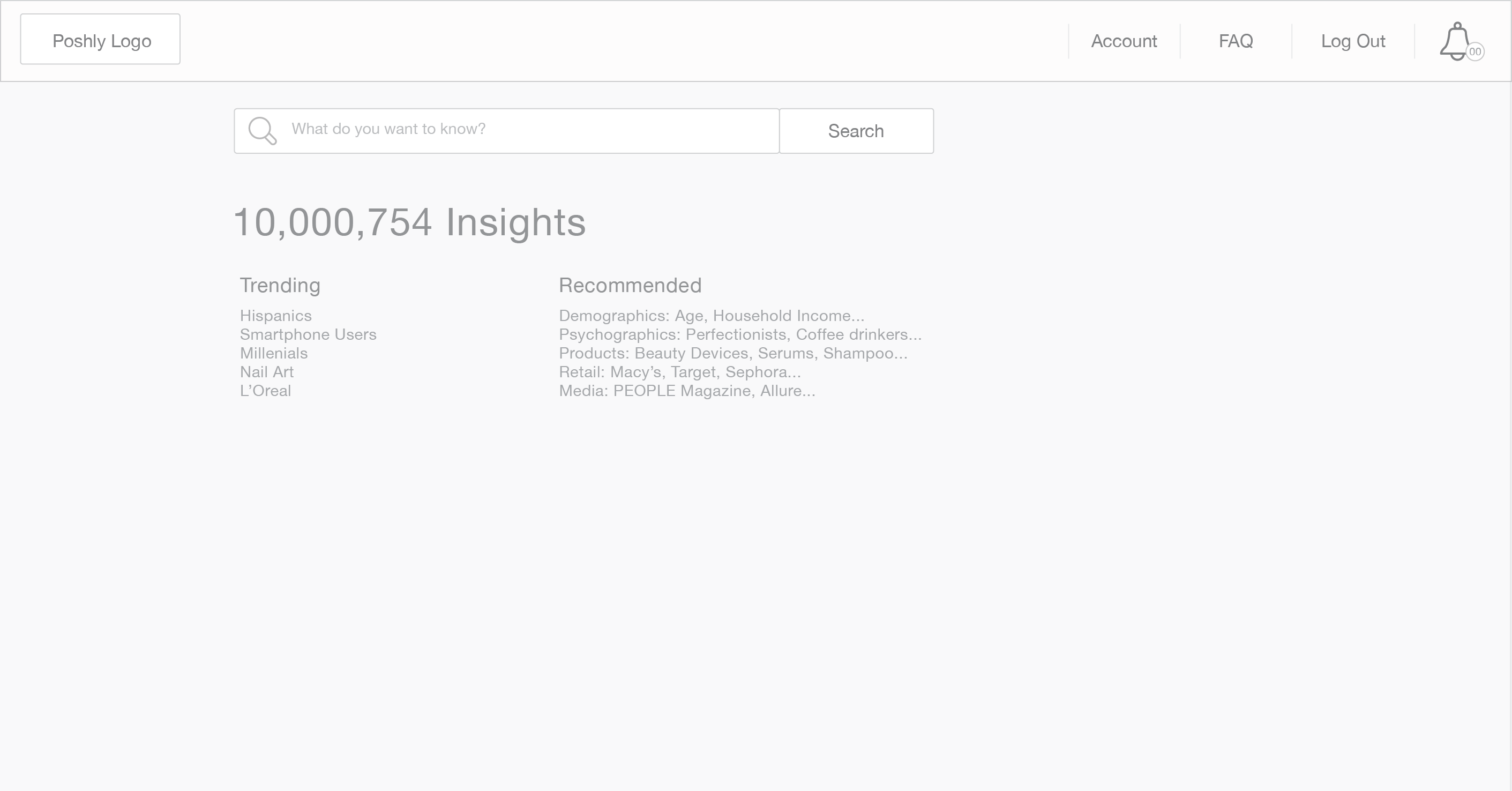
How might we improve navigation and complex big data presentation for our customers?
1
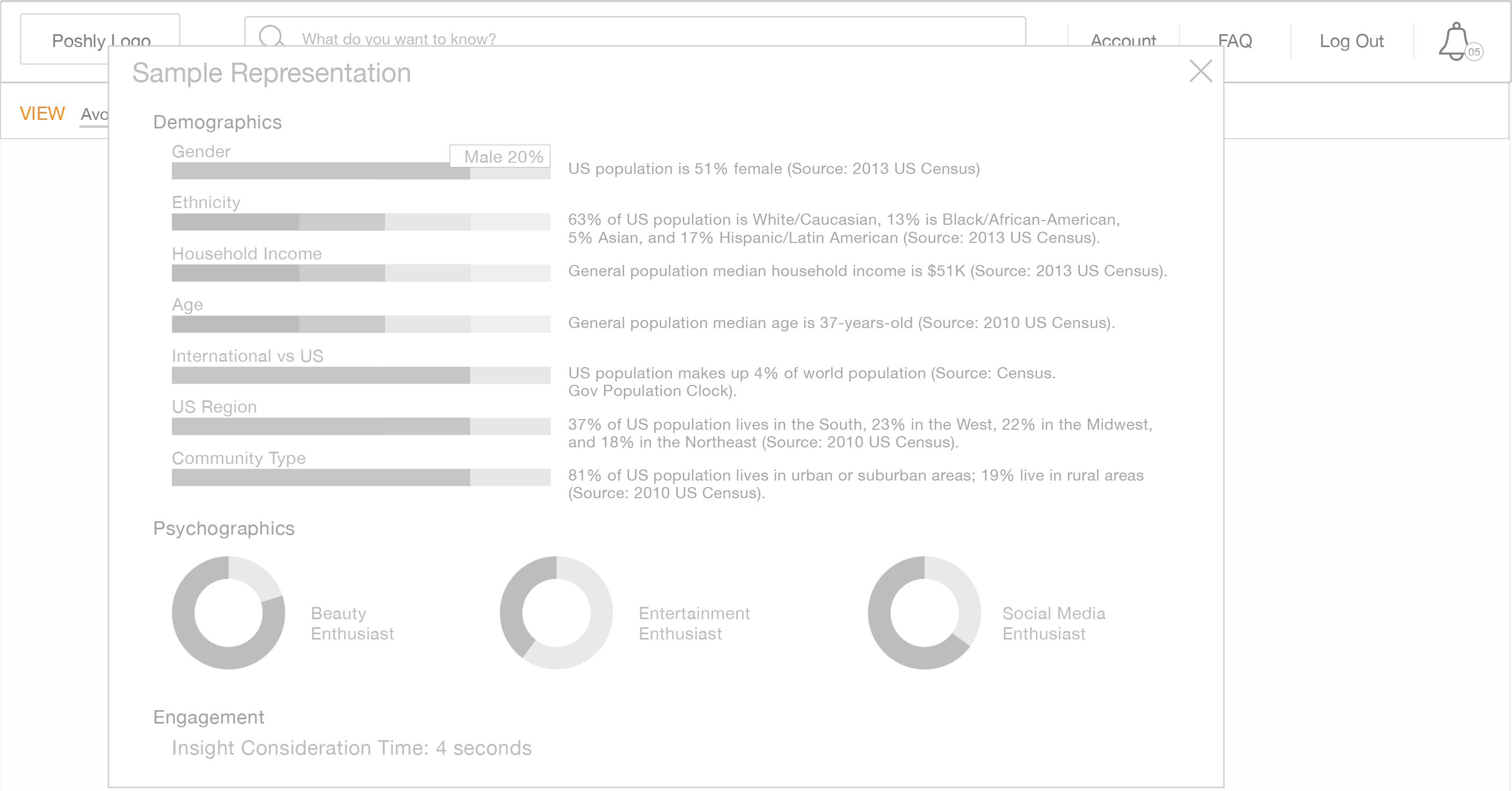
Comfortably displaying data to support more
client needs
2
Improve information architecture, navigation, and page layouts
3
Provide customers with a delightful data platform experience
INITIAL INSIGHT
Discovery & Data-Driven UX Audit Dive Deep | Customer Obsession
I began by auditing the existing Wizard of Oz Prototype and conducting stakeholder interviews to understand business goals and engineering constraints. Then I moved into validating UX assumptions using real behavior.
Initial concept storyboard provided by Poshly team
Unintuitive navigation
Complex information architecture made the platform difficult to navigate for customers
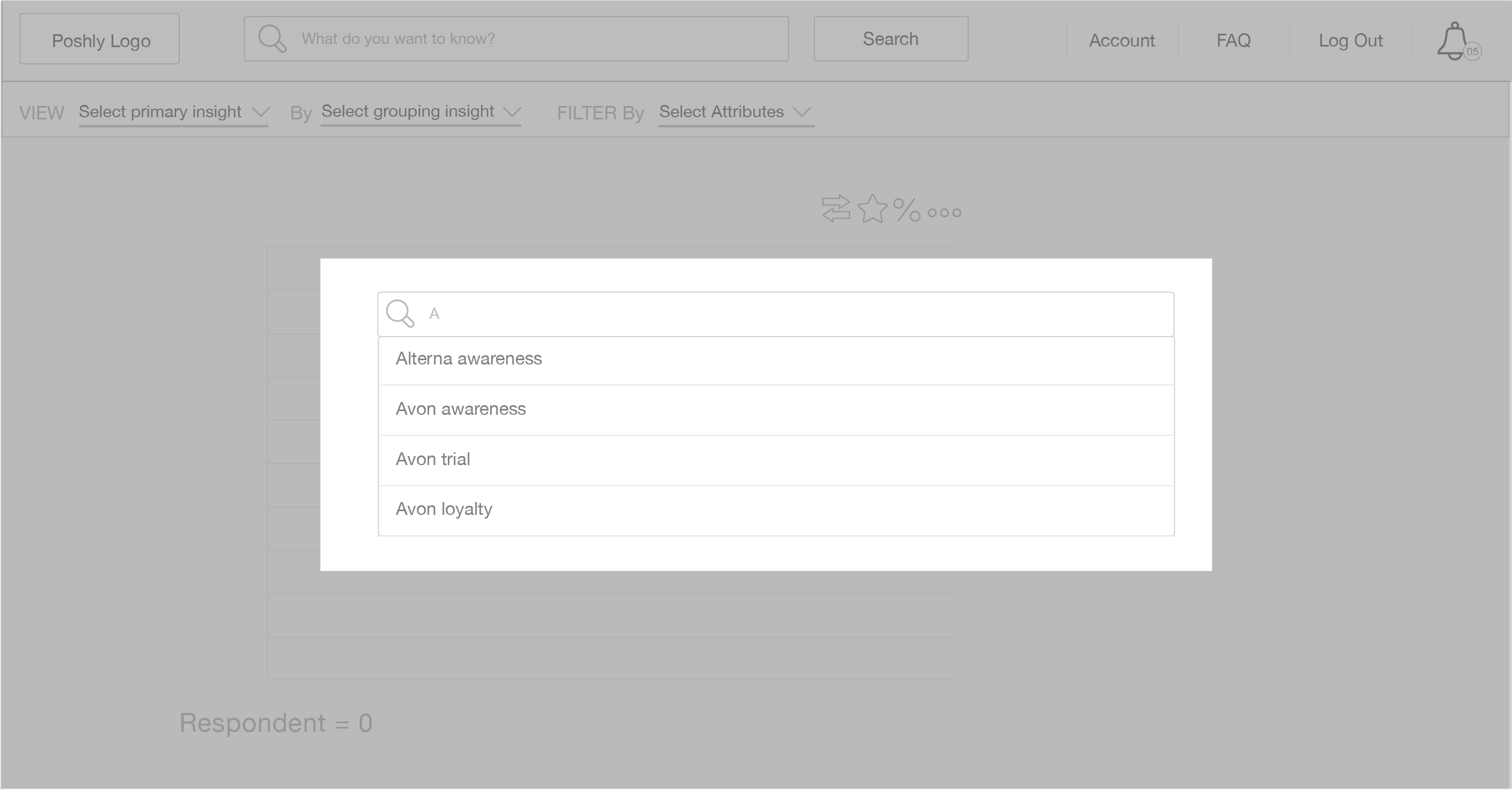
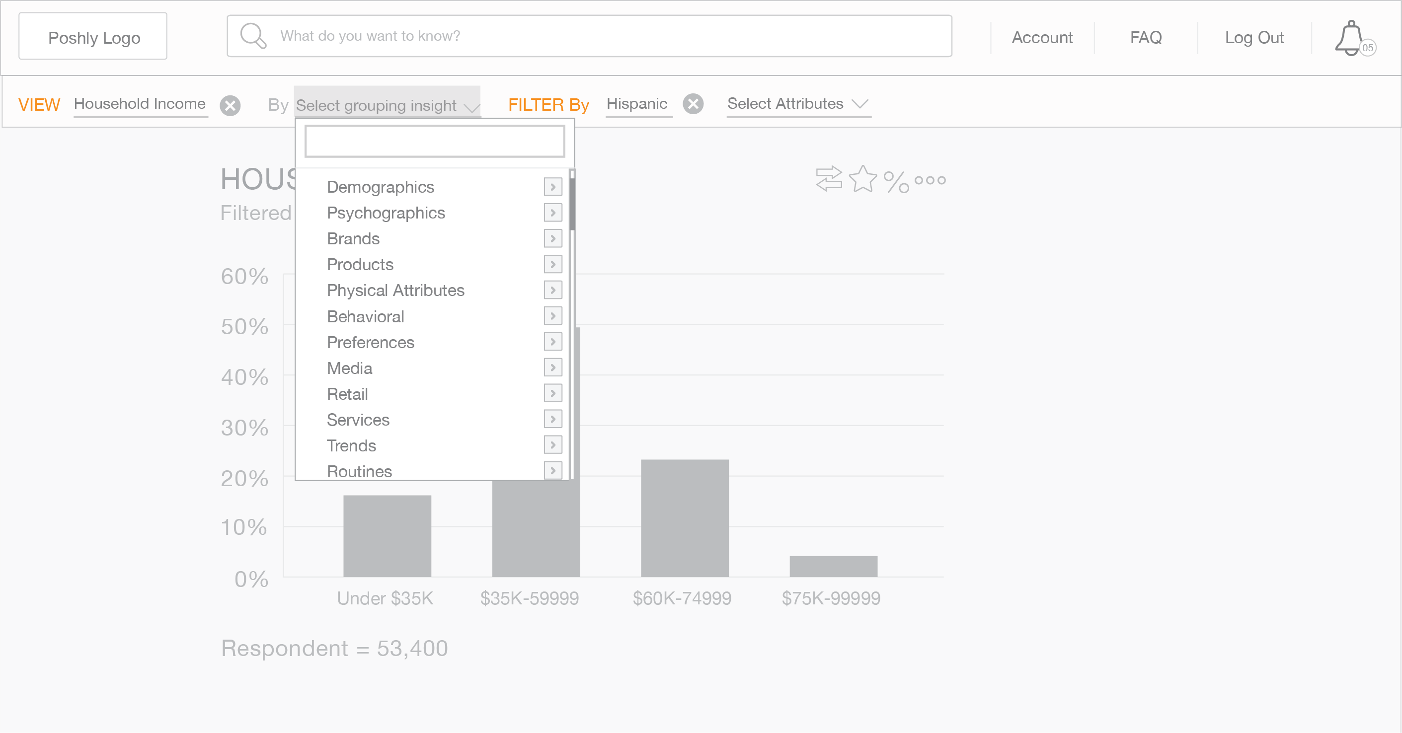
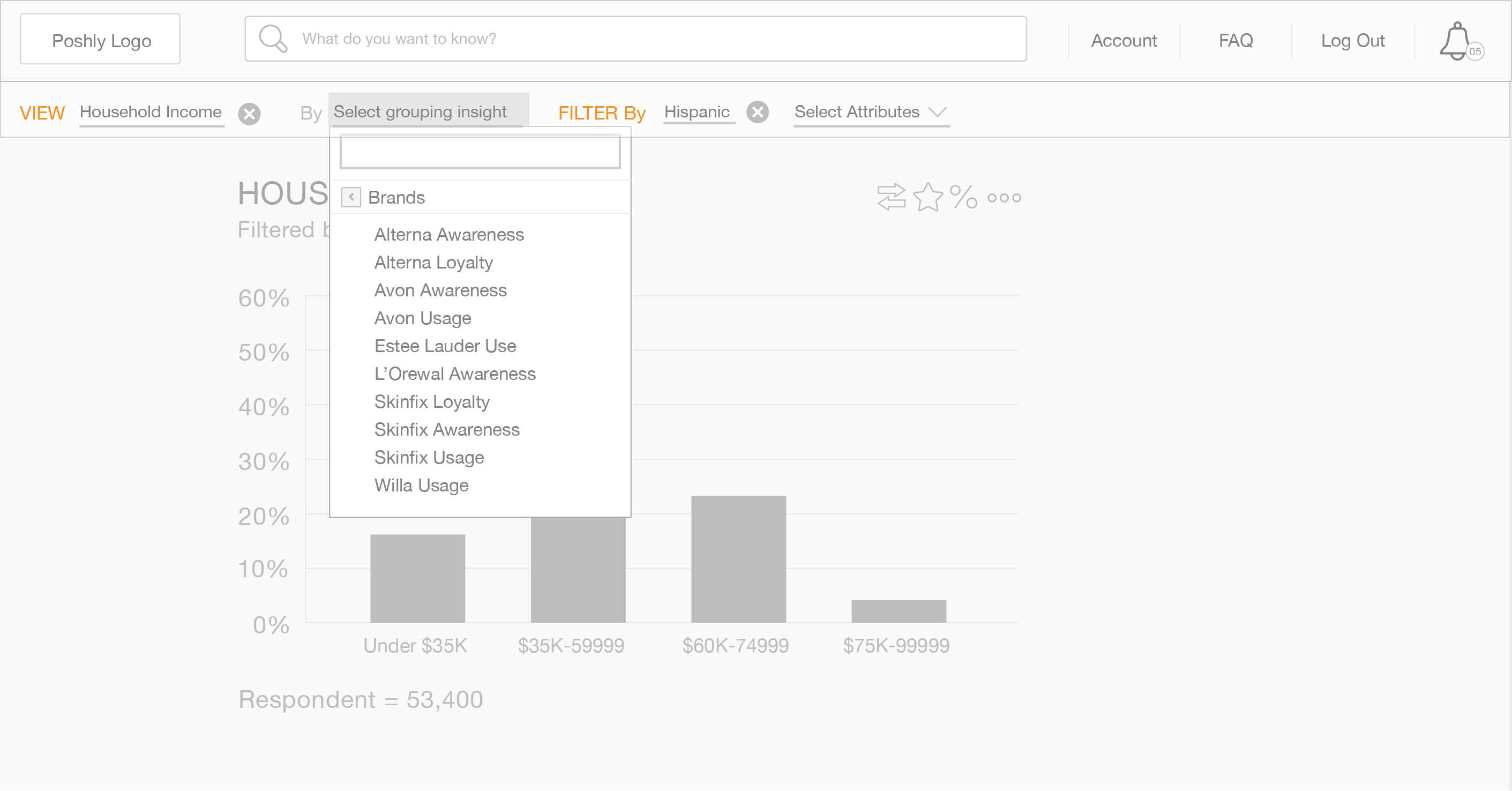
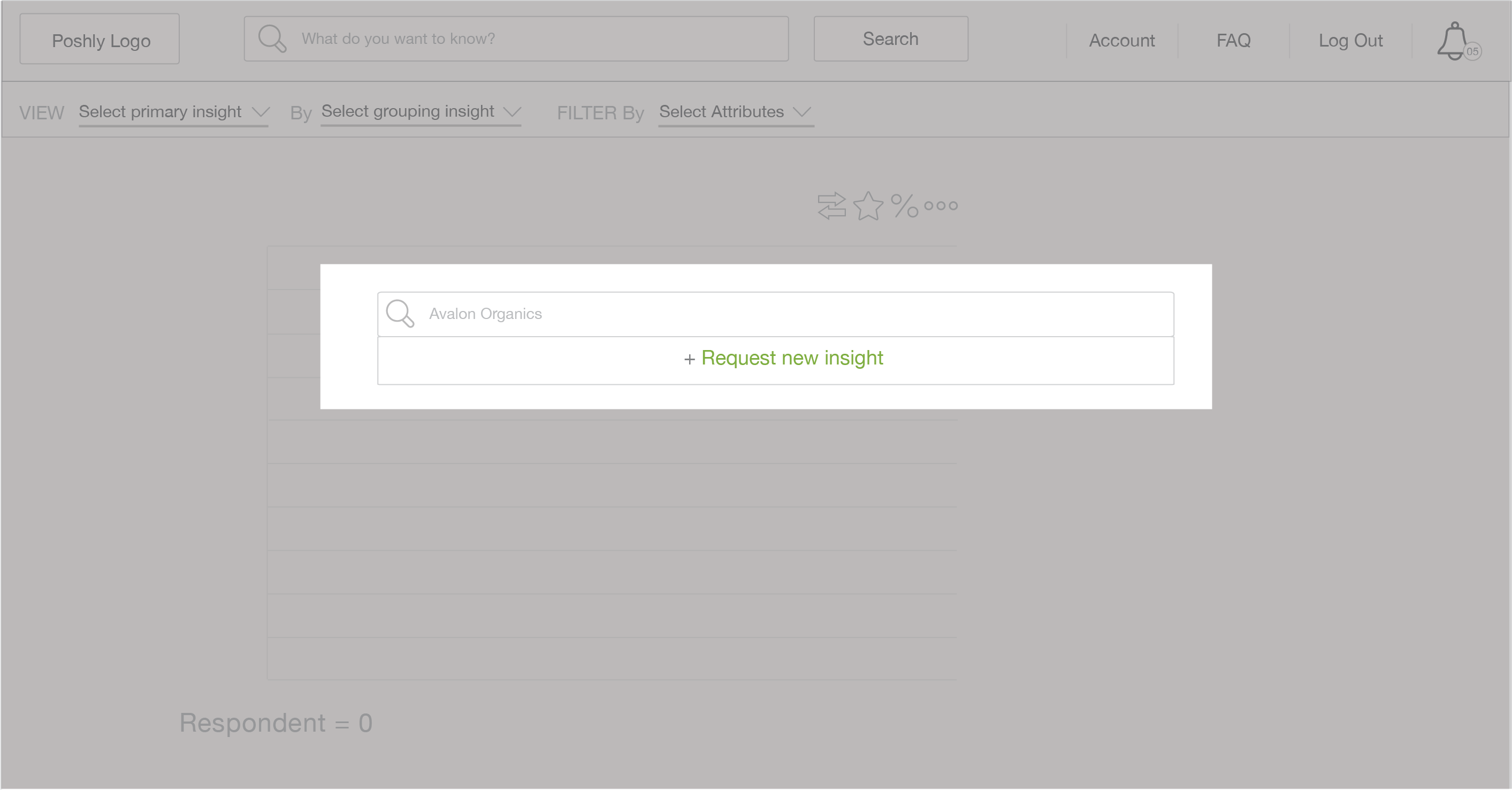
Filter challenges
Main filter button was too hidden. Complex filters presented upfront at the risk of overwhelming the user.
Inefficient dashboard
The homepage dashboard was crowded, cluttered, and difficult for users to scan at a glance
Unfamiliar toolbar iconography
Icons used were not representative of the actions they were meant to communicate
ADDRESSING PAIN POINTS
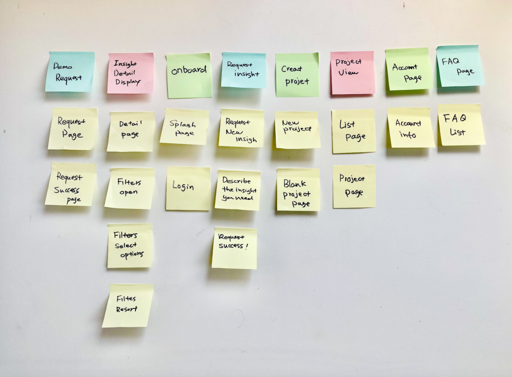
Stakeholder alignment
I facilitated card sorting exercises with Poshly stakeholders and leadership to align on a direction and improve the overall information architecture.
Card sorting on the whiteboard with post-it notes
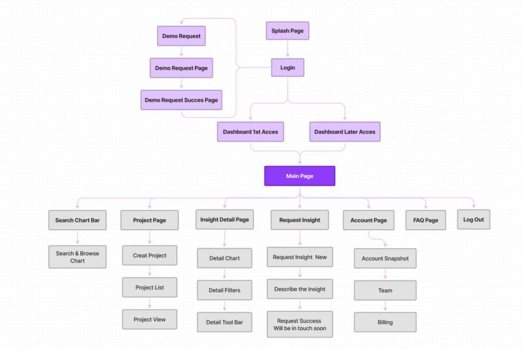
Information Architecture
FINDING A BALANCE
Understanding cross-functional team needs
Working under limited time and budgets, I still aimed to deliver a product that made users happy, satisfied business requirements, and incorporated developers’ challenges. With this in mind, I created components that could be reused across the platform to improve UX and engineering efficiency. This helped to reduce technical complexity and also established familiar patterns for the user.
USER RESEARCH
Early low-fidelity prototype testing
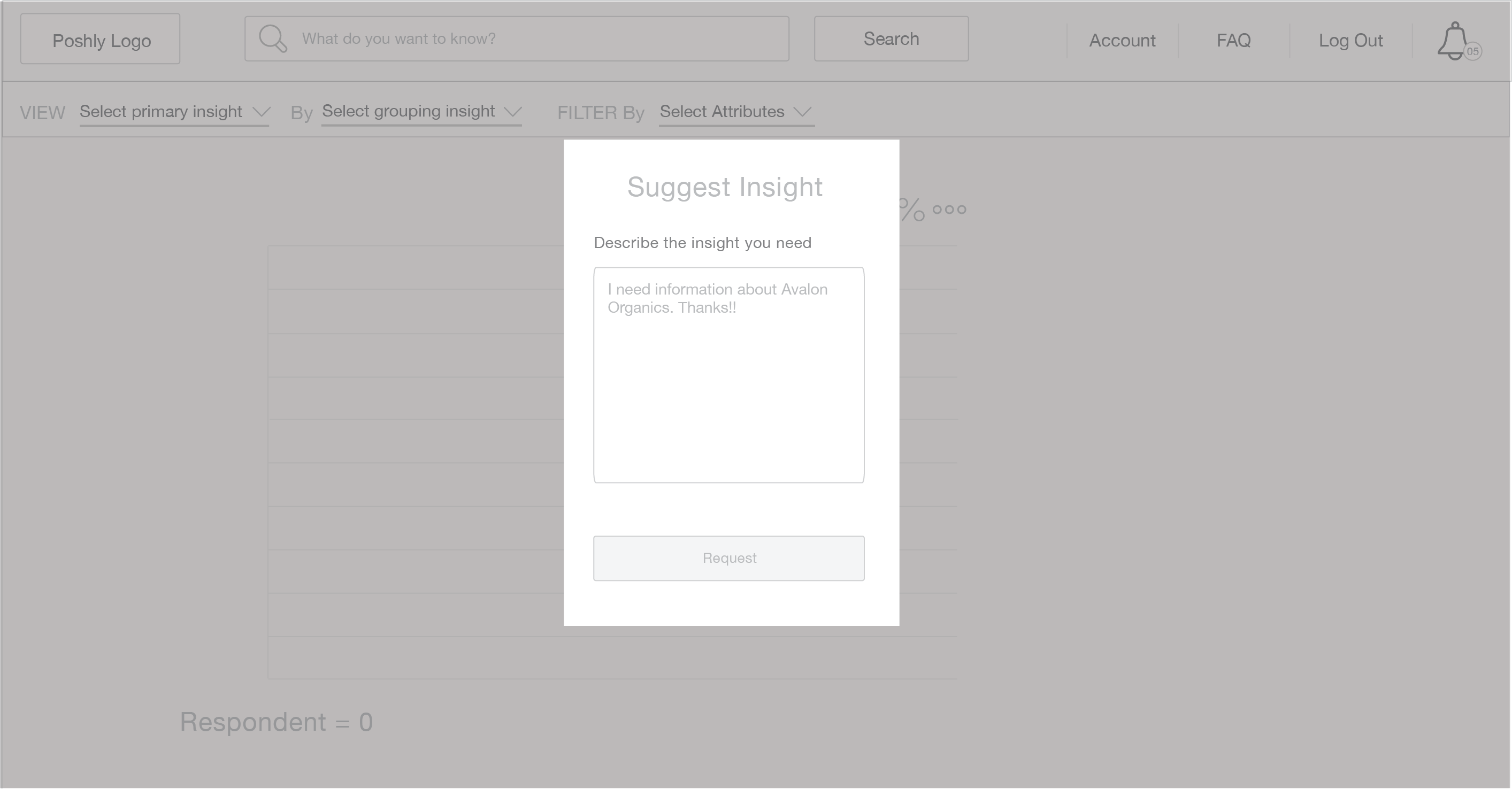
I used Invision to build wireframe prototypes to get early feedback on initial designs from internal stakeholders. Using these prototypes, I conducted a series of remote tests over Zoom with Poshly teammates in the marketing team, engineers, and the CEO. Key insights included…


DESIGN ITERATIONS
Brand and identity updates
Being the sole designer in a scrappy startup, I wore many hats on top of UX, including visual design to evolve the Poshly brand and identity. For visual consistency, branding color, type, and other elements were also incorporated into the high fidelity design system and component library that I defined.
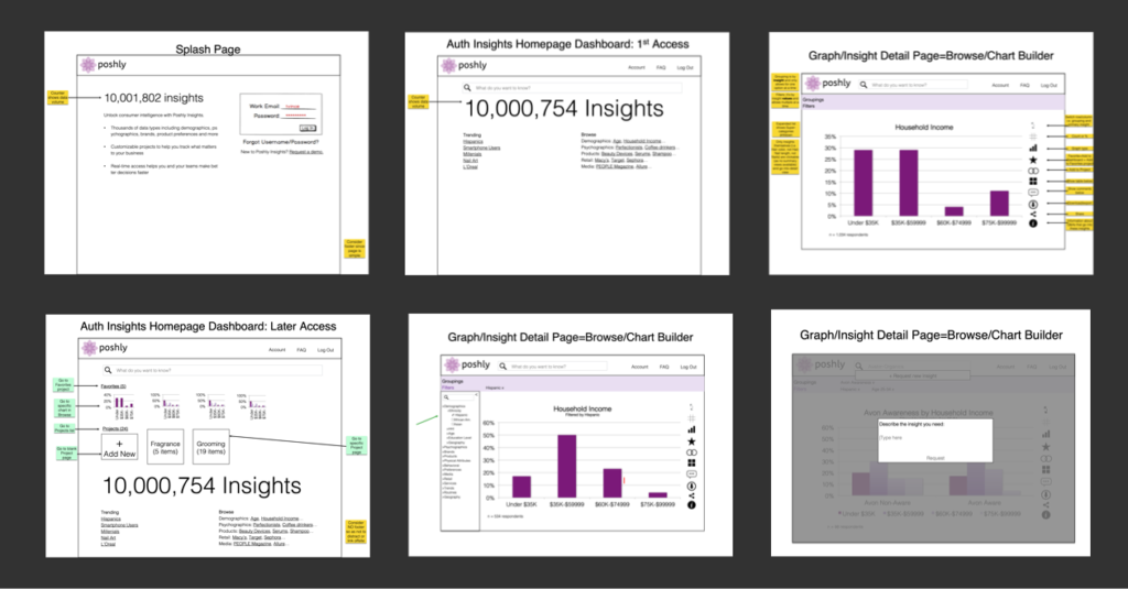
Working toward pixel perfect designs
After several iterations of low-fidelity designs and more internal user testing, I progressed toward high-fidelity designs and an updated prototype, leveraging the new design system.
IMPACT
Project Outcomes
-
By reorganizing the flow and simplifying filter options, we reduced the number of steps by approximately 40%. As a result, users could complete key tasks significantly faster, leading to 35% increase in conversion rate after launch.
-
I single-handedly designed the entire MVP platform—from user flows to high-fidelity UI—modernizing the experience and boosting perceived value, making the product feel credible and market-ready.
-
Helped acquire world-class clients like HP, L’Oréal, and Shiseido through tailored features.
-
Reduced costs by 3x, increased developer efficiency, and saved Poshly $200K by designing the full MVP platform myself.
35
Percent increase in the conversion rate.
2X
Increase in Perceived Value
3
Reduced the costs
”Jinhua is an exceptional and talented product designer. During our time working together at Poshly Inc., she singlehandedly designed the first version of our data insights platform, which became instrumental in acquiring marquee clients such as HP, L'Oréal, and Shiseido. Jinhua is not only highly effective at tackling complex product challenges, but she also collaborates seamlessly across business, analytics, sales, strategy, and engineering teams. Her optimism, creativity, and positive energy brightened every project she touched. I highly recommend Jinhua for any role requiring thoughtful design and interdisciplinary collaboration.
Doreen BlochPoshly, CEO & Founder
”Jinhua has done an exceptional job modernizing our UI and UX here at Poshly. She was a fantastic person to work with! Highly organized, with a very strong work ethic, passionate and engaging. That's her - responsible designer, has no problem to work hard when necessary. Able to find creative solutions to complex user workflows, design issues all while working with remote and local teams.
10/10, would love to work with again!
Bradley FalkCTO / Cofounder
”Jinhua was a huge asset to the Poshly team. We worked together on several projects spanning UI/UX for our data analytics platform to marketing projects. She has a sharp eye for good user flow, works quickly and is extremely effective collaborator even working with a remote team. Jinhua would be a the top of my list to work with again.
Liz WhiteHead of Strategy & Development (C-level)
RETROSPECTIVE
What I learned + next steps
-
Designing for startups requires a high level of discipline and thoroughness. Completing work on time and under budget was critical. Recording stakeholder interviews instead of manually taking notes helped streamline communication and save time.
-
The MVP stage is a critical foundation for product success. Early planning and frequent adjustments helped avoid major issues during development.
-
While time and budget constraints limited formal large-scale user testing, we leveraged live client prototype sessions led by our CEO and internal user proxy testing through our CMO.
-
In future iterations, I would expand direct external user testing earlier in the process to refine and personalize the experience based on broader usage feedback.